Calendar App Design
Author Name • June 15, 2012 01:11 PM
Over the past year or so, I've slowly been developing a calendar app for work that pulls data from an Exchange calendar and displays a custom view of that calendar. We have mounted more than 20 iPads outside of conference rooms so that when someone wants to know what that room's upcoming schedule is, they can simply tap around on the iPad and see all of the events.
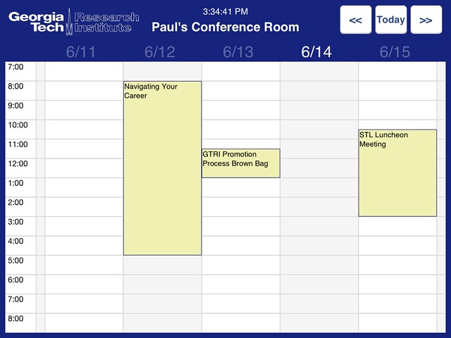
At this point, I have most of the functionality that I want in the app (of course we will think of more to add later), but design was not my focus. Here is the app's design as of a few weeks ago:

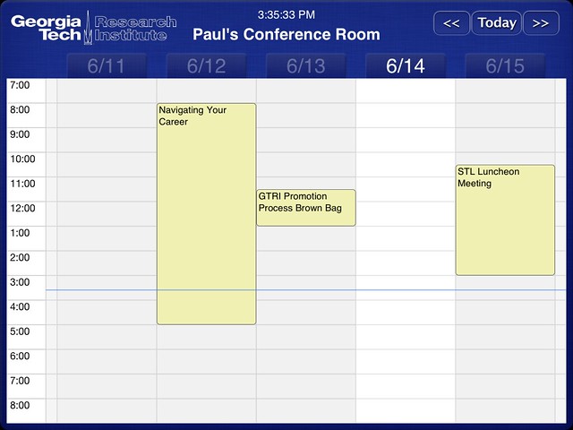
As you can see, it's kind of bland. I knew I needed to polish it up a little bit, but I also am very aware of the fact that I'm not a graphic designer. However, I came across this post by Tope Abayomi on Ray Wenderlich's most excellent iOS tutorial site about making a leather nav bar. I tooks those principles and made some pretty major improvements, I think, to the app. Then I added a few more things like the real-time time slider and rounded corners on the events. If you're a designer, or even a non-designer, and you have more ideas for improvement, let me know.
