Brizzly - a fresh new way to use Twitter
Author Name • September 3, 2009 12:11 AM
It seems like Twitter is all the talk around the tech news bubble these days. You can't listen to an episode of Buzz Out Loud or This Week in Tech (my two favorite technology podcasts) without at least one mention of this little social network that was more or less launched at the 2006 South By Southwest (SWSX) festival in Austin.
On the surface, twitter seems kind of dumb. I explain it to friends as being like FaceBook, but only with the status update feature. That's about it, except people have built services on top of twitter that make it incredibly more useful than simply status updates. I won't go into all of those services here, but I have been beta testing one particularly useful way to interact with twitter, and that service is called Brizzly, created by the folks at thinglabs.
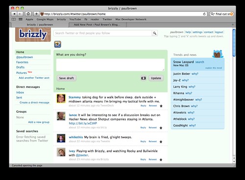
Brizzly main page
General Interface
I've been testing Brizzly for almost two weeks now, and I've found that it just makes twitter easier to use. There aren't a lot of features to talk about, but they are well-implemented. The general interface is simple and well thought out. Posts appear in the center of the screen, and the sides contain navigation/filtering links and trending topics. On the left, you can choose to see your entire timeline or just your @replies or DM's, and you can create custom searches. A blue dot appears next to any item that has new messages. This is particularly useful for custom searches, as there is no need to use search.twitter.com any more! (there is also a search bar across the top of the Brizzly page, which is convenient). The trending topics are nice to have, and you can see an explanation of any topic by clicking it.
A nice touch to these sidebar items is that they are stationary as you scroll down the page. Another nice feature is that when you get to the bottom of the timeline that is currently visible, the page automatically appends the next set of tweets, just like Google Reader does (funny thing, since two of the lead developers, Jason Shellen and Chris Wetherell, came from the Reader team).
Also worth noting is that when you receive a Direct Message, a window appears above the trending topics with the message, and you can basically treat it like a chat window and respond to the message or close the window. And finally, regarding the general interface, it is nice that an asterisk is prepended to the site's title when there are new messages (like GMail's number of unread messages in its title). This means you don't have to keep refreshing the page to see if something new is there.
Embedded Pictures/Videos and Unshortened URL's
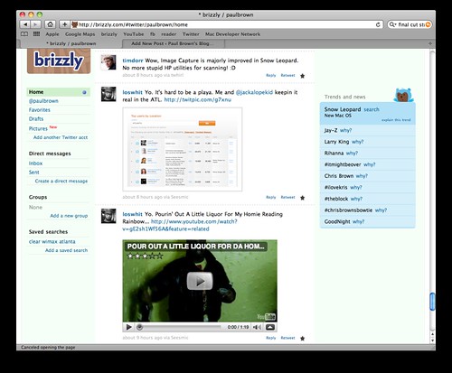
One killer feature is the in-line embedding of images and videos from TwitPic, Flickr, YouTube, and Vimeo, among others. This allows users to never have to leave the site to see pictures/videos that are posted using the most popular image and video hosting providers.
Example of embedded images and videos
While embedded pictures and videos has always been a feature, yesterday the Brizzly team added an image uploading feature into the service. As announced on TechCrunch, the images are hosted on the Amazon servers (that also host the Brizzly application), and they are given a http://brizzly.com/pic/*** link. This is a nice feature, but I think this might not be as universally friendly with the rest of the 140-character twitter world because of the longer links.
Brizzly also expands URLs that have been created with any of the more-than-enough URL shorteners out there. For example, if someone posts a bit.ly link to twitter, I will see the original link, not the bit.ly link. This is really handy for security reasons, so I at least know what domain name I'm headed to when i click the link. Aside from security reasons, it's just kind of nice to see real links instead of shortened links all over the place.
Conclusion
Like I said, I've been using Brizzly for almost two weeks, and I love it. There are some minor bugs, but this thing is still in beta, so that's perfectly fine with me. The one bug I have noticed the most is when Brizzly thinks I have new posts to the timeline, and I click refresh only to find no new updates. I've seen this happen on most browsers on both Windows and Mac.
Overall, Brizzly makes it much easier to use twitter, and I'm looking forward to the Brizzly team rolling out new features as they come out of beta. If you use twitter, head on over to www.brizzly.com and sign up for an invite. It took about three weeks for me to get my invite after signing up.

